Master Visual Hierarchy with Grayscale Mode: The Designer's Secret Weapon
Este contenido aún no ha sido traducido al Español. Te mostraremos la versión en inglés a continuación.
You've just spent hours perfecting the color palette for your latest project. The vibrant gradients look stunning, the brand colors pop beautifully. Then your client drops the bomb: "The hierarchy feels off. I can't tell what I should look at first."
Sound familiar? Here's the uncomfortable truth every designer needs to hear: those gorgeous colors you're so proud of might be hiding fundamental design flaws. There's a reason why design schools teach students to start in grayscale—when you strip away color, only strong composition remains. Eagle's grayscale mode brings this professional technique to your everyday workflow.
The Color Trap: Why Even Experienced Designers Fall For It
Studies show that 68% of design revisions stem from composition issues that were masked by color choices. Let's examine how this plays out across different design disciplines.
The Brand Identity Crisis
A senior designer at a Fortune 500 company recently shared their wake-up call moment. They'd created a stunning logo using vibrant gradient effects that looked incredible on screen. But when the logo needed to work on packaging, signage, and merchandise, it fell apart. "The shape itself had no character," they admitted. "If I'd checked it in grayscale first, I would've caught that immediately."
Photography's Hidden Weakness
Professional photographers know this secret: amateur work often relies too heavily on color grading to create mood. Strip away those trendy orange and teal tones, and many photos reveal poor lighting choices and weak composition. That's why pros regularly toggle to black and white preview while shooting—it's the fastest way to evaluate whether the fundamentals are solid.
The Accessibility Time Bomb
Here's a sobering statistic: 1 in 12 men and 1 in 200 women have some form of color vision deficiency. If your UI relies solely on color to communicate state changes or important information, you're excluding millions of users. Grayscale testing immediately reveals these accessibility failures before they become costly problems.
The Real Cost of Color Dependence
Think about the last time you had to adapt a design for different contexts—print, digital, light mode, dark mode. Designs with weak underlying structure require extensive rework for each medium. One design agency reported saving 30% on revision time after implementing mandatory grayscale checks in their workflow. That's real money saved and deadlines met.
The pattern is clear: color should enhance great design, not prop up weak composition. The best designers know this, and they have a secret weapon for keeping their work honest.
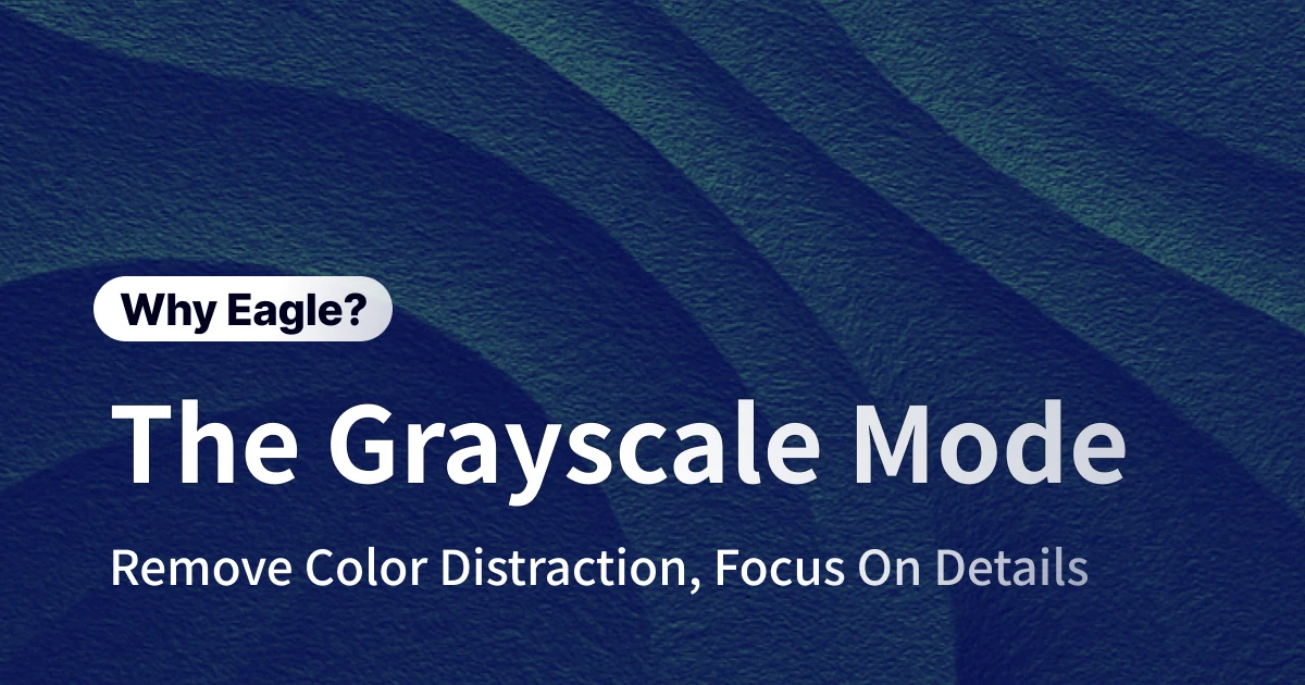
Eagle's Grayscale Mode: Professional Validation at Light Speed
Traditional methods for checking composition are painfully slow. Creating adjustment layers in Photoshop, exporting grayscale versions, switching between files—these workflows interrupt creative flow and waste precious time.
Instant Toggle, Zero Friction
Eagle's grayscale mode changes everything. Hit Ctrl + Alt + G on Windows or ⌘ + Alt + G on Mac, and boom—instant grayscale preview. No layers, no exports, no context switching. Just immediate visual feedback that keeps you in your creative zone.
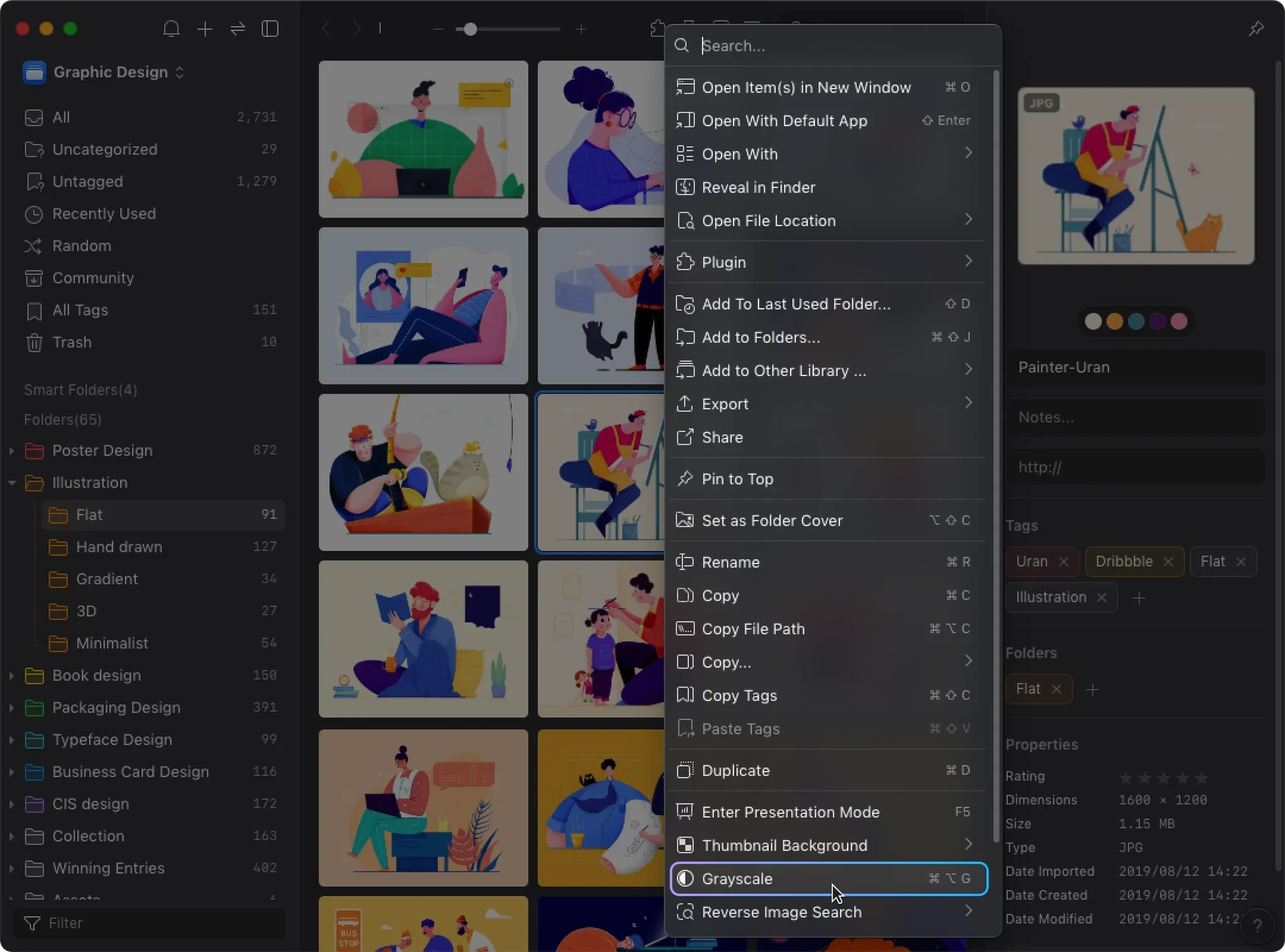
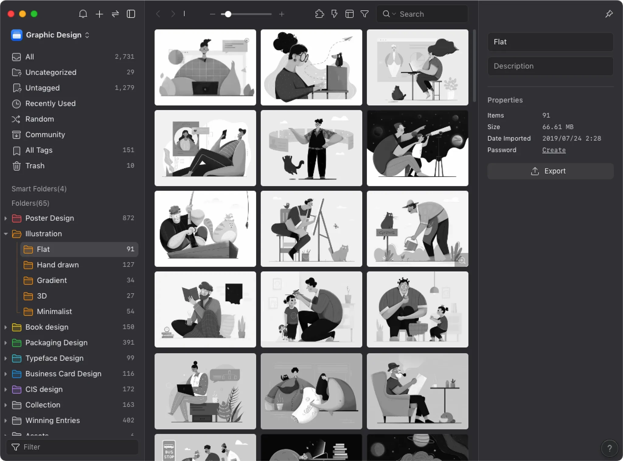
This is non-destructive preview at its finest. Your original files remain untouched while you evaluate composition, contrast, and hierarchy. Toggle back and forth as many times as you need—the only limit is how fast you can hit the keys.

Seamlessly Integrated Workflow
What sets Eagle apart is how grayscale mode integrates with your entire asset management workflow. Reviewing a batch of images? Toggle grayscale to quickly identify which ones have the strongest composition. Organizing your design library? Use grayscale preview to maintain consistent quality standards across all your assets.
Universal Format Support
Eagle's grayscale mode works with over 90 file formats. Whether you're checking PSD layers, evaluating AI vectors, reviewing PNG mockups, or even analyzing MP4 animations, everything works through the same simple shortcut. No more jumping between different apps for different file types.
The Power of Instant Comparison
The real magic happens when you rapidly toggle between color and grayscale. This instant A/B testing reveals exactly where color is compensating for weak structure. Many designers report that this simple practice has fundamentally improved their eye for composition. As one UI designer put it: "Once you start checking in grayscale, you can't unsee composition problems anymore."
This isn't just a feature—it's a philosophy. The best tools don't overwhelm you with options; they provide exactly what you need, exactly when you need it.
Transform Your Design Process: Let Structure Lead, Color Follow
After extensive analysis, it's clear that Eagle's grayscale mode isn't just about checking your work—it's about elevating your entire approach to design. By making composition validation effortless, it helps you build designs that work everywhere, for everyone.
The benefits cascade through every aspect of your work:
- Bulletproof Designs: Create work that maintains impact across all mediums and contexts
- Inclusive by Default: Catch accessibility issues before they become problems
- Faster Iterations: Reduce revision cycles by catching structural issues early
- Skill Development: Train your eye to see beyond surface-level aesthetics
Most importantly, Eagle makes professional-grade composition checking accessible to everyone. No complex workflows, no technical barriers—just hit a key combination and see your work with fresh eyes.
Ready to take your design game to the next level? Download Eagle's 30-day free trial and experience how grayscale mode transforms your creative process. See what your designs really look like when color can't save them.
Eagle uses a one-time purchase model—buy once, own forever, including all future updates. Start building stronger designs today. Because when you stop depending on color to carry your work, that's when your true design skills shine through.
Artículos relacionados